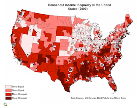
 Fig. 1. Household income inequality (US Census 2000 link)
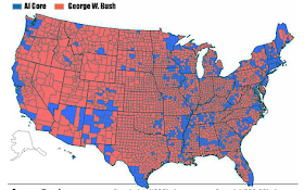
It's interesting to look at each of these data maps in detail. The comparisons of patterns are very revealing. Figure 4 is the most familiar to us -- it shows the geographical distribution of the mortgage crisis across the country. California and Florida aren't a surprise; but there are other hot spots across the country. For example, the "rust belt" of Michigan, Ohio, and Indiana shows a pretty dense set of high mortgage delinquency counties. But then consider the next crisis that may be coming -- consumer credit default. Here again the spatial patterns are interesting. Mississippi and Louisiana jump off the map on the poverty and inequality maps, and on the bank card default map as well. And then you can compare these state-by-state patterns with the top two figures, mapping poverty and inequality across the counties of the United States. And, finally, it's interesting to compare all these patterns of economic distress -- with the pattern of blue and red counties in the 2000 Presidential election.


Fascinating. What particularly caught my eye was the distribution of the darkest (=most unequal) color in the South. Reminds me of a map seen now on several political blogs contrasting counties where the proportion of Democratic voters increased versus those in which the proportion of Republican voters increased. At least at first glance, there appears to be a huge overlap between greatest inequality and increased Republican vote.
ReplyDelete