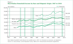
Working people in the US have suffered big economic losses in the past four years. Losses of jobs in the economy have pushed many working people from high-wage to low-wage jobs, and as we all know, many people have been pushed out of jobs altogether. The national unemployment rate was 8.6% in November, and very much higher in urban areas and African-American and Latino communities. Michigan's rate was 10.6% in October 2011 (link). White non-Hispanic households fell from $55,360 in 2009 to $54,620 (-1.3%), while black households fell from $33,122 to $32,068 (-3.2%) (Table 1). These differences in household income across race are stunning: black households started out at only 63% the level of white households in 2009, and they fell by more than double the percentage rate of loss from 2009 to 2010.
Here is a report from the US Census Bureau, Income, Poverty, and Health Insurance Coverage in the United States: 2010, that sheds some light on the changes of the past several years. Here are a few important summary findings:
- Real median household income was $49,445 in 2010, a 2.3 percent decline from 2009 (Figure 1 and Table 1).
- Since 2007, the year before the most recent recession, real median household income has declined 6.4 percent and is 7.1 percent below the median household income peak that occurred in 1999 (Figure 1 and Tables A-1 and A-2).3
- Both family and nonfamily households had declines in real median income between 2009 and 2010. The income of family households declined by 1.2 percent to $61,544; the income of nonfamily households declined by 3.9 percent to $29,730 (Table 1).
- Real median income declined for White and Black households between 2009 and 2010, while the changes for Asian and Hispanic-origin households were not statistically significant (Table 1).
- Real median household income for each race and Hispanic-origin group has not yet recovered to the pre-2001 recession all-time highs (Table A-1). (5)
Here is what real median income looks like, broken down by racial group, since 1967.
We've tended to think of this period as a difficult economic time that will eventually come to an end. But perhaps that's too optimistic. Perhaps what we are witnessing is a structural adjustment of the US labor market, with a permanent downward shift in income for middle and low income people. And perhaps these shifts will be most extreme for African-American households. (The past decade seems to bear this out. From 2000 to 2010 white non-Hispanic households had declined 5.5%, while black households declined 14.6% during that same period (8).)
Here the concern is that maybe Bruce Springsteen was right -- "these jobs are going, boys, and they ain't coming back to your hometown." Jobs with decent wages -- manufacturing jobs, union jobs, professional service jobs -- have declined precipitously in the past twenty years (not just since the recession). And that means that the opportunities for many workers to have "middle-class" incomes have become much more restricted. Here is a sober report from Chemical and Engineering News --
The severe national recession of the past several years is having a negative impact on the employment and the starting salaries of chemists and chemical engineers. The latest data from the American Chemical Society on graduates from 2009 found that median starting salaries fell about 5% for those receiving bachelor’s and doctoral degrees compared with the previous year. New graduates with master’s degrees appeared to have gotten a jump in pay.Even the banking and financial sector has contracted (link):
The financial services industry, hammered by job cuts and record losses, is in for an even bigger contraction as the global recession deepens, said Marc Faber, publisher of the Gloom, Boom & Doom Report.
“The financial sector will contract and it will contract much more than we’ve seen so far,” said Faber, who was in Tokyo to speak at an event hosted by CLSA Ltd. Financial professionals have “been in paradise for the past 25 years.”
More than 275,000 jobs in the financial industry have been lost in the last two years, according to Bloomberg data, while losses and writedowns at global companies exceeded $1 trillion in the past year. Faber said the contraction could rival declines seen in the 1970s following the collapse of Bernard Cornfeld’s Investors Overseas Services that shook confidence in the industry for a decade.So the financial industry isn't providing ready opportunities for young MBAs; many of them too will need to find other, less well-paying jobs.
Does this mean that everyone in the US economy is facing downward pressure on wages and salary? Not exactly. There is a segment of the American economy that is doing very well indeed. Here is a graph provided by Lane Kenworthy demonstrating the growth in income of the top 1% (link). (Kenworthy's discussion is very good.) The top line is the median household income of the top 1%. The lower lines, showing virtually no growth, represent the median of the middle three quintiles and the median of the bottom quintile of households.
source: Consider the Evidence (Lane Kenworthy)
(Here is an interesting Google resource, the Public Data Explorer, that provides visualization tools for basic US economic and demographic data. This particular screen shows the growth of personal income per capita since about 1930, across the regions of the United States. (This is money income, not adjusted for inflation.) The second graph shows personal income per capita for selected metropolitan areas. The third graph shows the unemployment rates for Wayne County and Oakland County in Michigan.)


re the ken laneworthy graph
ReplyDeletedo I really have to say that if you have Y values that differ a lot, you need to use a % or log scale to show changes ?
I mean, what were you thinking when you put that graph up ?